

Avoiding Color Mismatch in Custom Apparel
Table of Contents
- Why Color Mismatch Happens in Custom Apparel
- Understanding CMYK, RGB, and Pantone Color Modes
- Pantone Color Matching Guide for Consistent Brand Identity
- How to Approve Digital Proofs for Custom Clothing
- Common Screen Printing Color Mistakes and How to Avoid Them
- Design File Preparation: Substrate, Color Separation, and Format
- Quality Control and Proofing Process Before Production
- Conclusion
Last Updated: August 13, 2026
Why Color Mismatch Happens in Custom Apparel
Your monitor displays colors using RGB (red, green, blue) light, but screen printing uses CMYK inks (cyan, magenta, yellow, black) mixed with pigments and binders. These inks sit on fabric and interact with its natural color, a white shirt and dark gray shirt render the same ink completely differently. Add variables like fabric type, ink opacity, and lighting conditions, and color mismatches become inevitable. Most aren't printer failures; they're failures of expectation management before production starts.
Understanding CMYK, RGB, and Pantone Color Modes
RGB is what your screen uses, additive color where light mixes to create brighter results. Your design might look perfect on your monitor because RGB has a wider color gamut than any printing method can reproduce. When you send an unconverted RGB file to a printer, you're sending instructions for something physically impossible. Reds become muddy. Bright blues turn purple.
CMYK is what actually gets printed, subtractive color where inks absorb light. The color gamut is smaller than RGB, meaning some colors your screen displays simply cannot be printed. A bright neon pink on screen won't exist on fabric.
Pantone is a standardized color matching system that bridges the gap. Instead of mixing percentages of four inks, Pantone uses specific premixed inks with assigned numbers. Pantone 185C will look the same whether printed in Los Angeles or New York, assuming genuine Pantone inks and consistent substrate.
The practical implication: design in RGB, convert to CMYK before sending to print, and use Pantone spot colors when brand consistency is non-negotiable.
Pantone Color Matching Guide for Consistent Brand Identity
Using a physical Pantone swatch book is the most reliable way to ensure consistent brand identity across production runs. Order the Pantone Fashion, Home + Interiors (FHI) guide for textile printing, as it shows how colors appear on different fabrics.
When you select your Pantone color, write down the specific number, "Pantone 286C" is not the same as "Pantone 286U" (U stands for uncoated). Communicate this number directly to your printer, not a screenshot or approximation.
Request a physical Pantone swatch approval before full production. A digital proof won't show actual ink on fabric. Ask the printer to print your color on the exact substrate you're ordering. Color separation and ink saturation shift dramatically based on what's underneath.
The Pantone Color Institute's official guidance on brand color standards emphasizes that consistency requires both standardized color selection and substrate awareness. When reordering, using the same Pantone number with the same printer on the same substrate gives you the best chance of matching.
How to Approve Digital Proofs for Custom Clothing
Digital proofs show design layout, placement, and approximate color, they do not show actual ink on fabric. Many color mismatches happen because someone approved a digital proof thinking it represented the final product.
Here's the approval workflow that prevents problems:
-
Review the digital proof for placement and design integrity. Is the design centered? Are dimensions correct? Is text legible?
-
Request a physical proof on your actual substrate. Tell the printer: "I need a sample printed on a [color] [fabric type] shirt in size [size]." This costs more upfront but prevents ordering 50 shirts that don't match expectations.
-
Evaluate the physical proof in multiple lighting conditions. Office lighting, natural daylight, and indoor evening lighting all change how colors appear.
-
Compare the physical proof against your Pantone swatch if color accuracy is critical. Hold them side by side in the same lighting. If they don't match, ask the printer to adjust before production.
-
Document your approval. Take a photo of the approved sample in good lighting. Keep records of which Pantone number was used, the substrate, and the date.
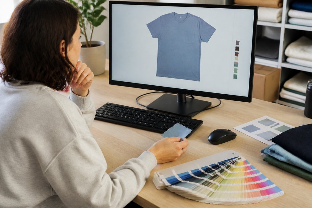
Skipping the physical proof step to save time or money is the biggest mistake here. A $15 sample approval prevents a $300+ reprint when 50 shirts arrive in the wrong color.
Common Screen Printing Color Mistakes and How to Avoid Them
Underestimating color shift on dark substrates. A bright yellow on white looks vibrant; the same yellow on navy looks muted and greenish. If you need consistent color across multiple substrate colors, use a white underbase or accept that color will shift.
Ignoring ink opacity requirements. Transparent red over a dark shirt looks completely different than opaque red. Specify whether you need opaque coverage or if transparency is acceptable. Opaque inks require more ink deposit and sometimes additional passes, increasing price.
Confusing color gamut with color accuracy. Colors at the extreme edges of what CMYK can reproduce may be technically printable but look nothing like expected. Stick to colors clearly reproducible in CMYK.
Skipping the color separation step. Color separation breaks your design into individual color layers, one for each ink. Poor color separation causes bleeding and muddy colors. Ask your printer about their color separation process.
Not accounting for thread charts if mixing screen printing with embroidery. Thread and ink have different light reflection properties. If your design uses both methods, approve samples separately and accept they won't be identical.
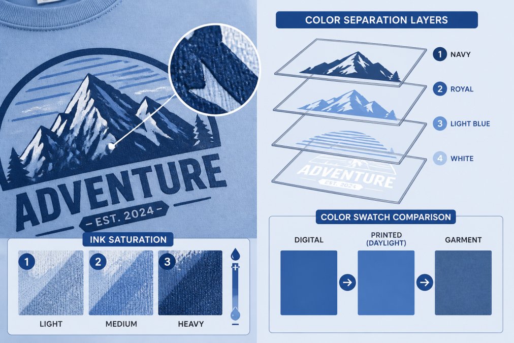
Most color mistakes happen because the designer, customer, and printer have different expectations about "accurate color." Setting that expectation early through physical proofs, Pantone numbers, and substrate-specific approvals eliminates most problems.
Design File Preparation: Substrate, Color Separation, and Format
Start with the right color mode. Design in RGB, then convert to CMYK before sending to the printer. This conversion shows you color shifts before production.
Understand your substrate. Cotton is porous and absorbs ink deeply. Polyester is smooth and ink sits on the surface. Performance fabrics can be tricky because ink doesn't absorb the same way. Ask your printer which substrates they recommend for your design.
Use vector files, not raster images. Vector files (Adobe Illustrator, EPS) scale infinitely and separate cleanly into color layers. Raster images (JPG, PNG) are made of pixels and don't separate well.
Provide files in the format your printer requests. Most screen printers want Adobe Illustrator (AI) or EPS files. Providing the wrong format forces conversion, introducing errors.
Include a color legend in your file. Label each color with its Pantone number or CMYK percentages. This removes guesswork for the printer's color separation team.
Account for registration tolerance. When multiple colors are printed, they need to align perfectly. Design with at least a small buffer between color areas.
Quality Control and Proofing Process Before Production
Quality control happens before production, not after. A strong process includes multiple checkpoints: digital proof review, physical proof on actual substrate, and pre-production inspection where the printer verifies screens are correctly burned, ink is mixed to specification, and equipment is calibrated.
Many printers skip the third checkpoint to save time. Don't let them. Ask what pre-production checks they perform. A printer worth working with will have a documented process: screen inspection, ink verification, test print on scrap fabric, and approval before running your full order.
Request a test print from your actual production run before they print your full quantity. If ordering 100 shirts, ask them to print 3-5 as a test first. Inspect these under the same lighting conditions you'll use for the final product. This catches issues like incorrect ink opacity, color separation problems, or substrate-specific color shifts.
Document everything. Take photos of approved samples, digital proofs, and test prints. Keep records of Pantone numbers, substrate specifications, and special instructions. When you reorder, this documentation is invaluable.
According to the American Apparel and Footwear Association's quality standards for custom printing, proper pre-production verification reduces defects by up to 40%. Make sure the test print matches your approved sample. If it does, production can proceed. If not, stop and troubleshoot before running the full order.
Avoiding color mismatch in custom apparel comes down to understanding the technical reality of ink on fabric and building communication into your process. Your screen shows one thing; production delivers another. The gap isn't a failure, it's a design challenge requiring substrate awareness, Pantone precision, and physical proofing.
When ordering custom apparel for meaningful moments, color accuracy matters. It's what turns a generic shirt into something intentional and celebratory. Start with a clear Pantone number, request a physical proof on your actual substrate, and approve it in realistic lighting. These three steps eliminate most color surprises.
| Step | Key Action | Impact |
|---|---|---|
| Color Selection | Choose Pantone number from fabric swatch book | Eliminates RGB-to-print color shift |
| Digital Proof | Review layout and approximate color | Catches design placement errors |
| Physical Proof | Print sample on actual substrate | Reveals real ink-on-fabric appearance |
| Pre-Production | Request test print from full production run | Confirms quality before full order |
| Documentation | Record Pantone numbers and substrate specs | Enables consistent reorders |
Frequently Asked Questions
Why do my custom apparel colors look different than my screen?
Your monitor displays colors in RGB mode, but screen printing uses CMYK inks on fabric substrate. RGB has a wider color gamut than CMYK can reproduce on cloth. Additionally, fabric color, ink opacity, and lighting conditions all affect how the final print appears. Always request a digital proof and compare it under the same lighting where the shirt will be worn or displayed.
What is the difference between CMYK and Pantone for apparel printing?
CMYK uses four process inks to create colors through mixing, while Pantone Matching System (PMS) uses pre-mixed spot colors for exact color consistency. Pantone is ideal for brand identity and color accuracy across production runs. CMYK works well for multi-color designs but may show color shift between batches. For custom apparel with strict brand colors, Pantone provides superior consistency and color harmony.
How can I use digital proofs to prevent color errors?
Request a digital proof that shows your design on the actual garment color you selected. Review it in natural daylight and indoor lighting to catch color bleed or visibility issues. Compare your design file colors against the proof and ask your printer to show how color separation affects the final result. Approve the proof only after confirming ink saturation and color accuracy match your expectations.
Does fabric color affect the final print result in custom apparel?
Yes, significantly. A dark garment color will shift lighter inks and reduce color vibrancy, while a light substrate allows brighter, more accurate colors. This is why an underbase (white ink layer) is often used under colored inks on dark fabrics to improve color accuracy. Always request samples or digital proofs on your chosen garment color to see how the substrate affects the final appearance before approving production.
This article was written using GrandRanker